
This is a Tag Team Event by fuonlyknew and fundinmental.
Today Sherry and I are featuring the new cover art for Wormwood by D.H. Nevins.
The author has also written an exciting guest post all about the process of creating and choosing her new cover.
And I’ve also reposted my review for ya.
One more thing. There’s a giveaway for a chance to win your own copy of Wormwood, with the new cover!
After entering my giveaway, head on over to Sherry’s blog at fundinmental for another chance to win!
~~~~~
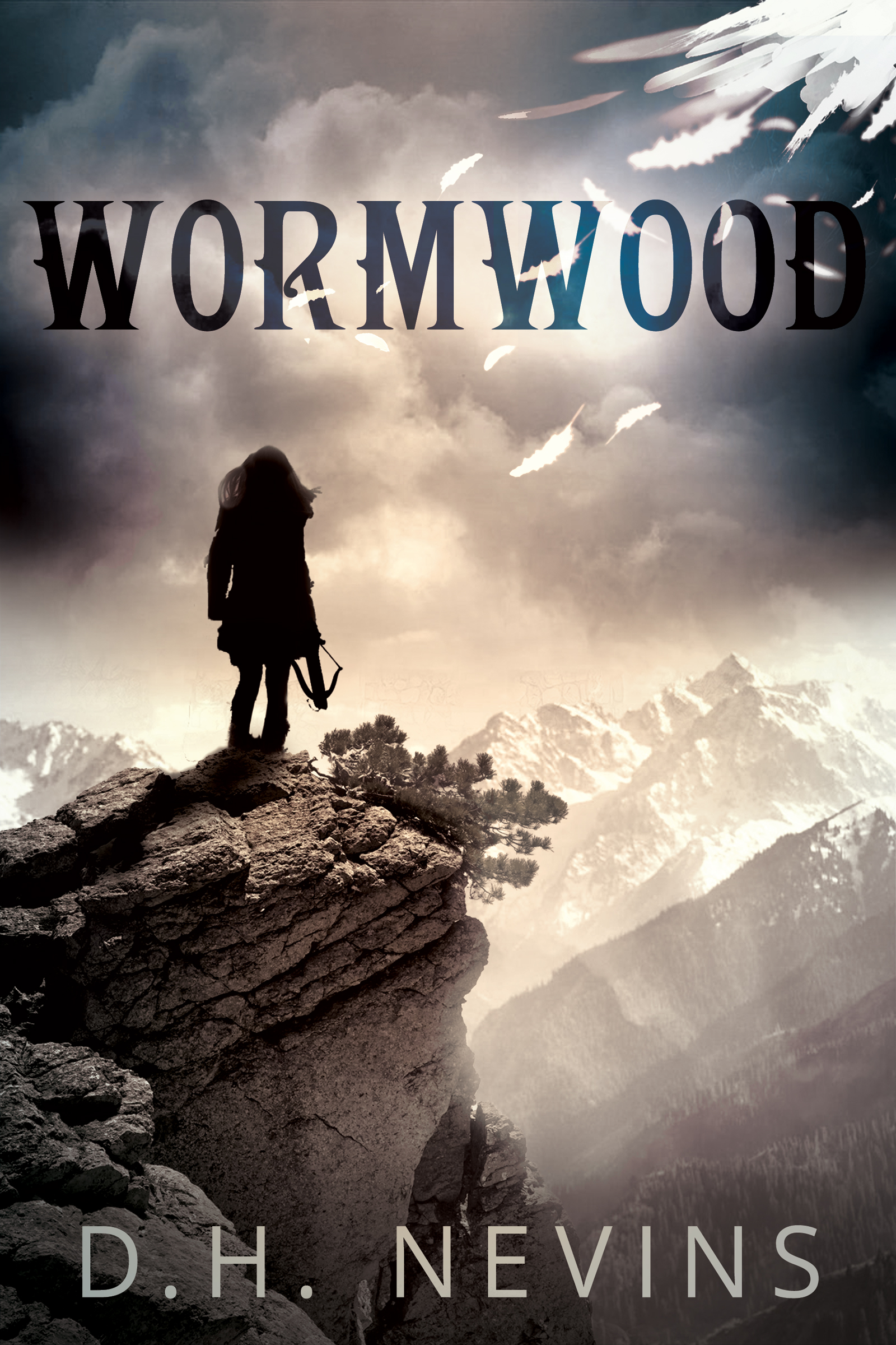
Here is the new cover. Is it not spectacular? The faint hint of color like a ray of light. The wing tip and falling feathers. The peak she is standing on and the silhouette of her holding her crossbow, looking outwards.
All of these things pertain to the story and bring back fantastic memories.
Bravo!
MY REVIEW
I’m reposting my review so you don’t have to leave the page!
I did not read the back flap before I started reading Wormwood. I had also received another book in the mail that day and mistakenly thought this was the book about aliens. Boy, was I surprised.
The first chapter introduces you to Kali. She is a trail guide at Pinecrest National Park. A quiet hike up to her favorite spot, Lookout Peak, starts out normally enough, but a light breeze quickly becomes a tree snapping gale. The once clear skies have turned a heavy grey-black, the clouds tumbling over each other as they race towards her.
This would not be so bad if the woods had not suddenly gone silent. Not a sound could be heard. The winds had stopped and all was still. Not even a bird song was heard. Into this silence came a rumbling that turned into a roar. The ground began to vibrate under her feet and she could see something was coming. The trees started to shake and then to fall, the ground began to roll. Kali ran.
The earth twists and buckles as she tries to reach the safety of Lookout Peak. Trees and shrubs reach out as if to grab her. She sees her goal and rushes forward. Stillness. All around her the earth is raging. Great rents appear, lava flows up from below, the skies open up and rain and hail lash down, but from her vantage point all she feels is a mild tremor under her feet. How can this be?
Kali wants to move out from under the overhanging rocks and edges around them to a clear space. The rocks could fall at any moment. There is a campfire burning. She is not alone up here. A quick look around reveals a figure standing on the cliffs edge, his arms stretched out towards the devastation that is still raging below.
TIAMAT
I tell ya, I was not prepared for this. I was exhausted from the tension I experienced following Kali’s mad dash to safety. My description is just a wee bit of what she goes through.
I am so excited just thinking about what I want to tell you. This happened and that happened! And what? I have never read a story quite like this. There is so much going on. The story raced to its conclusion, leaving me stunned.
At times I was scared. Other times I was so mad. And at one part, I realized I was crying, and it hurt.
D. H. Nevins has written a fantastic story of the end of the world and the last survivors. Perhaps this description is too simple, but I hesitate to tell much of the story. I want you to read it like I did. Unprepared and wide-eyed. I want you to get to know each character and discover just what is really causing all the destruction.
I hope when you read Wormwood, you’ll tell me how it made you feel. Did you experience it like I did?
A huge Thank You to the author for an extremely well written story in which to immerse myself.
Beyond 5 STARS
~~~~
Check out this amazing trailer!
~~~~
Synopsis
Against a devastated landscape, a legion of one hundred fierce half-angels is hell-bent on purging the Earth of all humans. But one of them, the tormented Tiamat, struggles against his mission, and when he rescues a beautiful woman named Kali, he finds the attraction as troubling as it is miraculous. Can Kali trust the one creature who could be responsible for her ultimate demise?
Beautifully written and excitingly told, Wormwood creates a world that is as strange as it is compelling. Filled with brilliantly executed twists and turns on every page that are guaranteed to keep you guessing, Wormwood is one of the most exciting debuts of the year.
~~~~
Enjoy the guest post by D.H. Nevins
A New Cover for Wormwood
First of all, before I say anything else, let me introduce Wormwood’s new cover. Oh, and before I do that, I should forewarn you that I’m a tad biased about this…
The New:
This beauty took my breath away the moment I saw it. As an author, I couldn’t ask for a better representation of my work. And I’m kind of picky—so that says a lot! The image projects a mood that reflects the feel of my story so perfectly, I knew the cover artist understood Wormwood on multiple levels. But even if we’re just talking aesthetics, well, although I am most definitely biased, I think this is one fantastic-looking cover!
.
.
.
.
..
The Old:
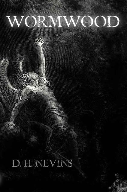
I originally had a different cover for Wormwood. It was a simple black and white etching by Gustave Doré, depicting a fallen angel reaching towards the heavens. The sheer turmoil apparent through the angel’s expression and pose not only fascinated me, but seemed a perfect depiction of the conflict raging through Tiamat, a half-angel in Wormwood. However, the etching–although classic–was hardly a trendy cover. The story itself was very well-received, but I found that people had trouble getting past the antiquated-looking cover in order to take a chance on reading what was within. My love for the cover, it seemed, was a lonely one!
.
.
.
The Cool How:
About a month ago, I was contacted by cover artist extraordinaire, Derek Murphy. He had read Wormwood and subsequently offered to make up a new cover for the book—for free. Surprised, flattered and curious about the vision he had for Wormwood, I heartily agreed.
Then, as you know, the resulting cover blew my expectations out of the water! Its impact was immediate.
.
.
Why it Works:
The image depicts the book genre clearly. The colour contrast is striking, which catches the eye instantly. Plus, it’s incredibly professional.
It also fits the story.
On a literal note, the protagonist is a strong female, adept with a crossbow, yet still out of her element. However, she would never admit it. I could see this in her stance. Yet the cover holds so much more than a simple literal representation of Wormwood. Derek recreated the feel of the book perfectly. The mixture of light and darkness remind me of a review Wormwood once received which, in part, said, “The lines will be blurred between good and evil, love and hate, truth and lies, and hero and antagonist.” The hazy fusion of sunlight and shadow reflect this beautifully. The unsettled, foreboding skies mirror the mood of this dark, post-apocalyptic story, and the falling feathers are a nice touch. They hint at the half-angels in the story without hitting potential readers over the head with their existence. The fact the feathers are broken and falling is also perfect, but I hesitate to say why… after all, I don’t want to spoil the most exciting parts of the book!
The Alternatives:
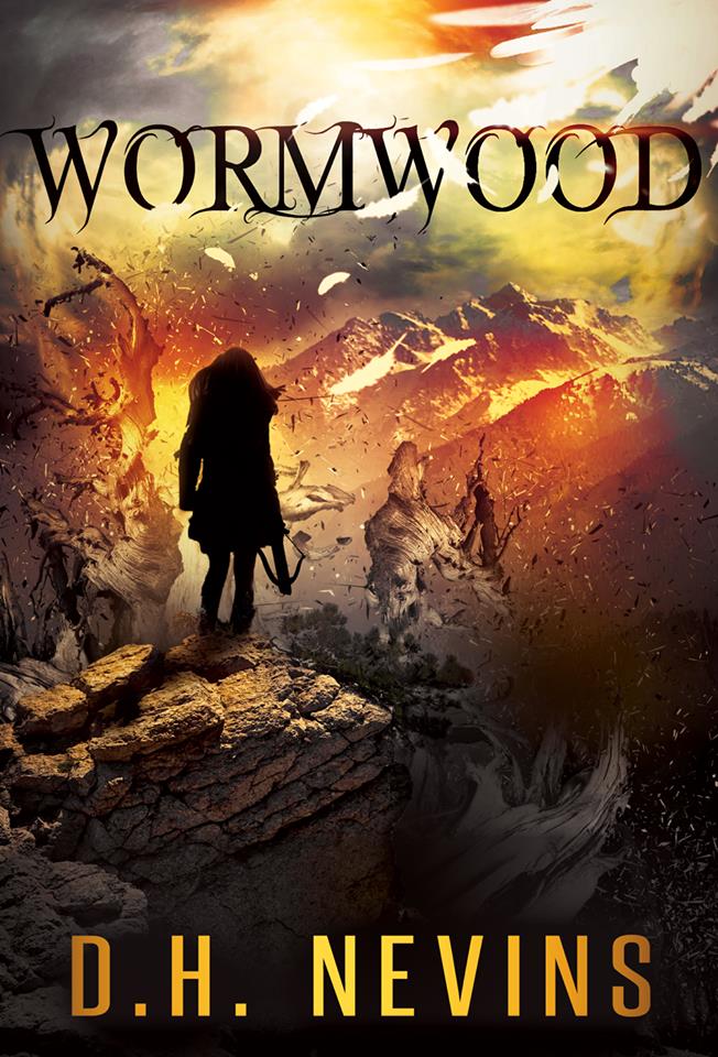
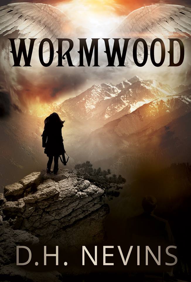
It was exceedingly difficult to select my favourite cover. Every mock-up Derek created was incredible in its own right, and it would be a shame not to share them. So in all their glory, here are the other options he came up with.
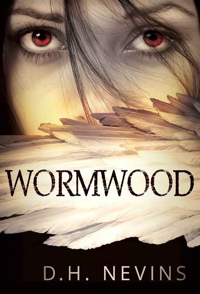
The third one—the one with the wing obscuring the girl’s face—is so amazing, I’d very much like to use it as the cover for my sequel, Angel of Shadow. What do you think?
My Thanks:
Naturally, I wouldn’t be sharing this with you if it wasn’t for Derek Murphy. His outstanding covers and unprecedented talent can be seen on his website, CreativIndie Covers. Have a look at http://bookcovers.creativindie.com/
~~~~

For more about D.H. Nevins and her writing:
Website ~ Goodreads ~ Facebook ~ Twitter
~~~~

D. H. Nevins is giving away 5 eBook copies of Wormwood.
An International Giveaway
To enter, please leave your email address with your comment so I can contact you if you win and answer this question:
“Which cover would you choose and why?”
This is a Tag Team Event hosted by myself and Sherry at fundinmental.
You can visit Sherry’s blog for another chance to win and see what she thinks about Wormwood HERE.
Giveaway ends July 30th.
~~~~
Thanks so much for visiting fuonlyknew and Good Luck!
To see all of my giveaways click on the lucky horseshoe below!






I LOVE this cover. They did a great job collaborating!
I know!! I keep coming back to it!
Out of 3 alternatives, I prefer the first (left) one. It depicts clearly the idea of a strong female adept with a crossbow. And its font brings a fantasy theme to the cover.
koukkunokka@anvianet.fi, too excited to comment I forgot the email to join giveaway 🙂
What a view too!
The first one, the colors are bright and majestic! However I do like #3 too.
I think she wants to use the third one for another book in this amazing series!
The first cover is amazing and majestic. I like them all, but I go back to that one, due to the colors.
I like the second one where the heroine is looking at a future that’s a bit clouded and uncertain…..as all tomorrows are.
Great way to look at it. It’s a hard choice with all of them being so good.
The new one absolutely, it seems so crisp I love the feathers in the upper corner. It gives me an idea of what the book might be about. My email is onlyonemorechapter at gmail dot com
Good eye for the wing tip. The place she is standing at is big in the story too. If you read this book, you can’t help but recognize it!
I would say use the “New” cover. Title font is awesome, feel is very foreboding, girl is depicted as very strong and the crossbow says, “Get ready for action.” Feathers in the corner hint at fantasy without giving it away. Only thing I would change, is use the Author name font from #1 in the Alternatives as at small size it contrasts wit the rest (Yellow) and makes your name stand out. Reasoning: The only reason you really care about is I would pick up “The New” cover and read that book! Reasoning behind not choosing the alternatives—Alt #1) You don’t need the orange—too busy. Alt #2) full width wings is too HEAVY—you want to hint at the Angel storyline not beat reader over the head that it’s in there. Alt #3) Actually agree with you that this would be a good follow up, sequel cover. Changes I would make to Alt#3) Maybe Move Title to the top as this is where reader expects it to be. Make the Title font agree with the first in the series as that one is totally cool. That’s my biased opinion. Excellent Covers! I have to read your book.
Thanks for being so thorough with your reasons. This was a great comment and had me looking from cover to cover to see your points!
The book is excellent and I’ve been waiting a while for more. Visually written and stunning in plot!
For got to leave my email – stevew.windsor@gmail.com
I love the new one, but the one on the left is my favorite. The color of the sky brings it to like and seems ominous. <y email is cpbialois@gmail.com
All of them have their good points don’t they. It’s fun to read what does it for each of us:)
Definitely. It’s one of the things I love about art. We each see different things for different reasons. 🙂
I like the first (left) cover because it features a strong female with a crossbow that appeals to my inner science-fantasy nerd. I prefer it over the middle cover because I find the wings on the middle cover off-putting, but I like the way it’s shown on the left cover with blurring of the upper right corner of the cover. The cover on the far right reminds me of other book-covers on the market right now and it makes me think young adult paranormal romance (which might be reasons to not use it).
I like your explanations. They are dead on!
I like the new cover best. It has a haunting quality about it that fits the genre. Please enter me in the giveaway. My email is: batedave@gmail.com.
Thanks.
Dave Bates
Would definitely go with the second one.reading from left to right simply because of clarity issues, the choice of monochrome is far stronger and as readability goes, makes more of a visual impact., also there is an eerie feeling of uncertainty which captures your attention. ,,
The second cover has a spookiness that I really like. I have downloaded your book and can’t wait to start reading. I’ll send a review when I’ve finished. ~ Dennis
I definitely like the chosen middle cover the best. The colors are more muted and give a feeling of danger and creepy while not being so busy that it is distracting. The cover on my left, while the colors are eye catching and lovely, is in my opinion very busy and distracting. The cover on my far right, again is lovely but frankly it does not make me want to pick it up and see what the story is about. Yes the middle cover has a draw that gets my fingers itching. Thank you for sharing with us. I am definitely intrigued about Wormwood and I love cover art posts – double treat today 🙂
dz59001[at]gmail[dot]com
The third one, I like all three, but that one is more “in your face” dramatic
babyblue7299@yahoo.com
I’d go with the cover that was chosen. It conveys the most the feeling of bleakness and adversity I’d say.
Clicking on my name gets you to my email address. 🙂
Thank you so much for your comments regarding the covers. As I am so close to the project, it’s extremely difficult to have an unbiased perspective–so I’ve appreciated every word of your feedback!
Best of luck on the giveaway, everyone. And should you happen to read Wormwood, I would be equally glad to hear your opinion on that as well!
Thank you, Laura, for an incredible post. You and your sister never cease to amaze me. =)
Thank you D! This was a lot of fun and you sure got some great comments. Sherry and I are comparing our winners to make sure we don’t have any repeats and will send their info as soon as they respond back confirming.
So looking forward to having you back soon!